 Best Practices
Consistent Branding Through Hex Color Codes
Let’s say you created an awesome logo. Something like this:

The color palette used in your logo can inform the entire brand story from websites to print materials to PowerPoint presentations. You could approximate the colors by eye, but the key to doing it right is knowing your hex color codes. Take a look at Hex color codes explained for info on what a color code is. Here we’ll talk about how to use them.
In the awesome logo above, we have three colors:
- Yellow #FFD400
- Purple #7F3B96
- Pink #E9529D
These three codes should now be part of your brand book. They should be shared with all employees who might be making banners for an event or ordering T-shirts for your volunteers. Getting the color exactly right will tie together your brand even tighter.
In Microsoft Office products like Microsoft Word and PowerPoint, you can choose custom font and background colors. In the color dialogue, choose More Colors > Custom. There you’ll have the option to choose a color, input RGB values, or paste the hex codes from your brand book.
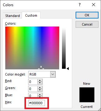
You can save them as templates and distribute them to your team to help everyone stay on brand.


